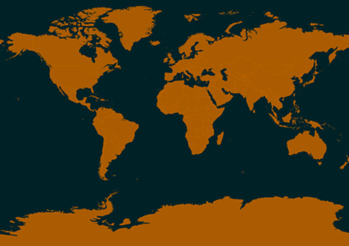
If Africa is the 2nd biggest continent in the world, after Asia, why does it look so small in the World map? That’s the confusion that the most commonly circulated world map has created.
Let me take you through a journey into the Mercator map. This world map created by Gerardus Mercator in the 16th century is the most circulated Atlas.
A plus for the Mercator map is that it preserves the angles and shapes of small objects, making it useful for navigation.
On the other hand, it distorts the size of landmasses. The landmasses closer to the poles (that is, the upper and lower ends of the Earth’s Geoid shape) enjoy greater distortion compared to those closer to the Equator (the centre line running through the Geoid shape).
When you look at the common Atlas you find around, this size distortion is why Africa looks small in comparison to Russia. Whereas Africa’s actual West-to-East width is over 7,200km, that of Russia is 5,900km.
What should you make of this?
1. If you ever learned geography in an African school, you have likely been fed a lie. This is because the Mercator map is one of the most basic, long-standing misinformation perpetrated against Africa.
2. The African Union is currently supporting advocacy to stop the use of Mercator maps in favour of more suitable maps. Despite my reservation against the dormancy of the Union over time, I believe this step is worth it and every African should chip in a word to support the noble initiative.
#YeahMomentsWithYO